They already chose you. Do not make them wait.
Navigational intent means the decision is made. Every second of friction between search and access is a user you lose for no reason.
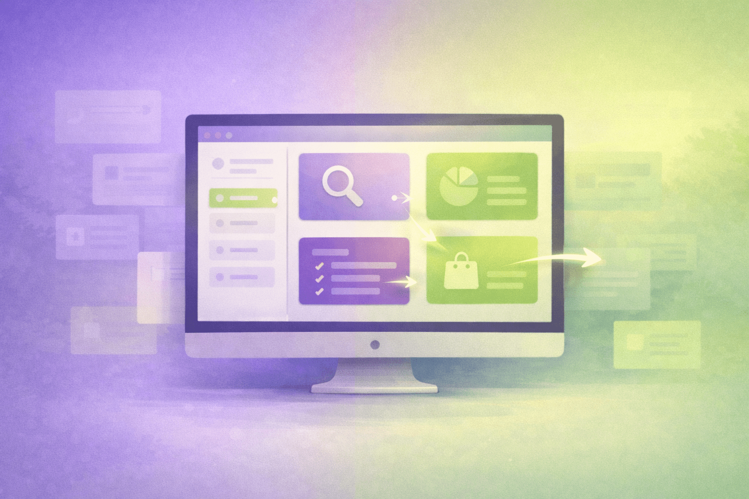
Navigational intent means the user already knows where they want to go. They are not researching options or learning about a topic. They want direct access to a specific page, tool, brand, or destination. Your job is to get them there instantly with zero friction. This is fundamentally different from informational or transactional intent, where users are still learning or deciding.
If your login pages, download pages, or customer portals have high bounce rates despite strong branded search traffic, you likely have a navigational intent problem. Users are searching for you by name but abandoning because you are forcing friction where none should exist.
Check your analytics for branded search terms like “[your brand] login” or “[your brand] download”. If bounce rate is above 40% or time on page is under 10 seconds, your navigational pages are broken. Jump to diagnostic signals →
Users search for:
Netflix sign in
Chase bank account
Salesforce pricing
Nike store locator
YouTube
The user has already:
- Made a brand decision
- Decided what action they need to take
- Determined which tool or page they need
- Committed to using your service or product
They are not comparing options. They are not learning. They are not evaluating. They just want access.
Most navigational pages fail because they add friction where none should exist. Marketing content before login forms. Product tours before account access. Comparison tables when users already chose your brand. Every extra click or scroll between landing and destination increases abandonment by 15-25%. Users searching with navigational intent expect access in under 3 seconds. Anything longer and they assume they landed on the wrong page.
What a Good Navigational Page Looks Like
Here is what users expect when they search with navigational intent. Notice what is NOT there: no marketing copy, no feature explanations, no product comparisons. Just direct access.
Form is above fold. No scrolling required. Zero marketing content. Clear alternatives (forgot password, sign up). Social login options visible. That is it. The user gets access in 3 seconds or less.
Action step: Open your login or primary access page on mobile right now. Time how long it takes from landing to seeing the login form. If it is more than 2 seconds, you are losing users. See the full structure checklist →
How to Structure Navigational Pages
These are not stylistic preferences. These are requirements. Violate them and users abandon your page.
- Primary action or destination above fold
- Single clear CTA (login, download, access)
- Zero marketing content blocking access
- Page loads in under 1.5 seconds
- Mobile-optimized forms and buttons
- Alternative paths clearly labeled (forgot password, sign up)
- Security indicators visible (SSL, trust badges)
- Brand consistency with main site
- Feature comparisons or product tours
- Marketing copy explaining why to use the product
- Popups or interstitials
- Newsletter signups before access
- Educational content about the tool
- Testimonials or social proof
- Pricing tables or upgrade prompts
- Anything that delays access to destination
Common Navigational Page Types
Different industries and business models have different navigational needs. Here are the most common types and what they should prioritize.
Login / Access Pages
Email and password fields above fold. Social login options. Forgot password link. New user signup path. No marketing content.
Download Pages
Download button above fold. System requirements clearly visible. File size and version number shown. Alternative download options (different OS, formats).
Payment / Billing Portals
Account login above fold. Direct link to billing section. Payment method update options. Invoice history access. Support contact visible.
Store Locators
Search by ZIP or location above fold. Map view immediately visible. Store hours and contact info for each location. Directions link.
Customer Service Pages
Phone number above fold. Live chat button visible. Email contact form. Account-specific support login. FAQ section below primary options.
Order Tracking
Order number input above fold. Email or account login option. Tracking number entry. Order history for logged-in users. Estimated delivery date visible.
How to Diagnose Navigational Page Problems
Your analytics will show clear patterns when navigational pages are broken. Watch for these specific signals.
High Immediate Exit Rate
Users land and leave within 3 seconds without interaction. Your page is forcing them through marketing content when they just want access.
Low Form Completion
Users start login or signup but abandon before submitting. Form is too complex, loads too slowly, or is buried below marketing content.
Brand Searches Not Converting
Users search your brand name + “login” or “download” but do not complete actions. They are hitting friction between search and destination.
High Mobile Bounce
Desktop performance is fine but mobile users abandon. Forms are not optimized for mobile or page loads too slowly on mobile connections.
Users Navigate Away Immediately
Heat maps show users clicking back to search results or site navigation within seconds. Your landing page does not match their navigational expectation.
High “Forgot Password” Usage
Disproportionate use of password reset compared to successful logins. Your login page may be confusing or forcing users through unnecessary steps.
Remove everything between the user and their destination. Test the page on slow mobile connections. Measure time from landing to successful access. If it is more than 5 seconds, you have too much friction.
Business impact: Reducing navigational page friction from 8 seconds to 3 seconds typically improves conversion by 30-50% on branded search traffic. For SaaS companies, this directly impacts trial signups. For e-commerce, it affects account access and repeat purchase rates. Learn how to measure this →
How Navigational Intent Differs from Other Intent Types
Understanding where navigational intent fits in the larger search behavior landscape helps you build the right page for each user goal.
Navigational: User wants access to Gmail. Query: “Gmail login”
Informational: User wants to learn about email. Query: “how does email work”
Navigational pages provide access. Informational pages educate. Confuse the two and both audiences fail.
Navigational: User wants to access Salesforce. Query: “Salesforce login”
Transactional: User wants to buy Salesforce. Query: “buy CRM software”
Navigational assumes decision is made. Transactional pages drive that decision. Login pages should never pitch products.
Navigational intent only exists when users already know your brand. If you are unknown in your market, users will not search for you by name. This is why brand awareness campaigns, content strategy, and modern search visibility directly impact your ability to capture navigational traffic.
How to measure brand strength: Track monthly search volume for “[your brand] + [key action]” queries (login, pricing, download, support). If this number is growing month-over-month, your brand awareness is working. If flat or declining, you have a visibility problem before you have a navigational page problem. See how I built brand search visibility →
Get Found. Get Understood. Get Chosen.
Intent misalignment is a systems problem. When pages do not match search behavior, users abandon and visibility breaks down. I help websites build SEO systems that match content to intent at every stage of the user journey.
See My SEO Systems Approach