Users are not browsing. They are evaluating.
Commercial intent sits between learning and buying. Structure your pages for comparison and users convert. Structure them for persuasion and they leave.
Commercial intent means the user is actively comparing options before making a purchase decision. They are not just learning (that is informational intent) and not ready to buy immediately (that is transactional). They are evaluating. Your job is to provide comparison frameworks that help them choose confidently. Commercial intent traffic converts 3-5x better than informational traffic because users are closer to a decision.
If your product pages rank well but do not convert, or your “best of” guides get traffic but no click-throughs, you likely have a commercial intent structure problem. Users want evaluation frameworks, not just feature lists or single-option pitches.
Check your traffic for queries containing “best”, “top”, “vs”, “comparison”, or “review”. If these pages have high engagement but low conversion or click-through to product pages, your comparison structure is broken. Jump to diagnostic signals →
Users search for:
Slack vs Microsoft Teams
top email marketing tools
which project management software
most reliable SUVs 2026
cheaper than Adobe Creative Cloud
open source CRM options
The user is:
- Past the learning phase
- Building a mental decision framework
- Comparing 3 to 7 options actively
- Looking for validation and reassurance
- Trying to avoid buyer’s remorse
- Close to making a purchase (days, not months)
They need structure, not persuasion. Help them compare and they will convert.
Most commercial pages fail because they push a single option instead of helping users evaluate fairly. Users in commercial intent do not trust biased recommendations. If your “best CRM” article only mentions your product, users bounce. If your comparison page is obviously slanted, credibility drops. Commercial intent requires honest evaluation frameworks with real pros and cons for each option. Pages that build trust at this stage earn 40-60% higher conversion rates than pages that push hard.
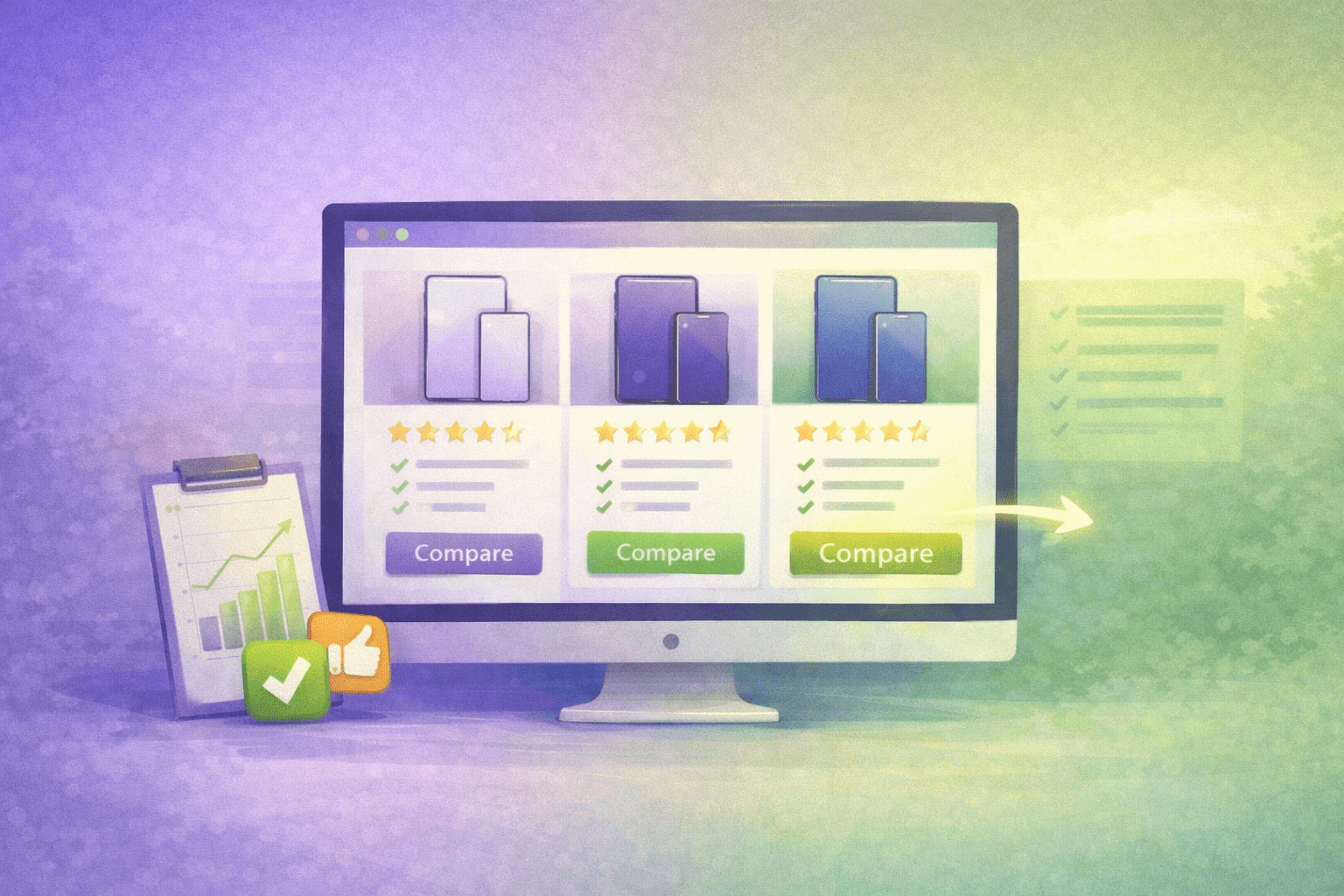
What a Good Commercial Page Looks Like
Here is what users expect when searching with commercial intent. Notice the structured comparison, clear evaluation criteria, and multiple paths forward.
Pricing: Free to $24.99/user/month
Pros: Timeline view, 200+ integrations, robust mobile app
Cons: Steeper learning curve, reporting limited on free plan
Pricing: $8 to $16/user/month (no free plan)
Pros: Extreme flexibility, beautiful interface, strong automation
Cons: Gets expensive with add-ons, can feel overwhelming
Pricing: Free to $19/user/month
Pros: Most features per dollar, unlimited free plan, fast development
Cons: Interface can feel cluttered, notifications overwhelming
Need timeline/Gantt views? Asana is strongest here.
Want maximum customization? Monday.com, but budget accordingly.
Budget-conscious? ClickUp offers the most features for the price.
Evaluation criteria explained upfront. Multiple options presented fairly. Each option has clear pros, cons, pricing, and “best for” scenario. CTAs for each option (not forcing a single choice). Decision framework at the end helps users match their needs to the right tool.
Action step: Pull up your top comparison or “best of” page. Count how many options you present and whether each has honest pros and cons. If you only show 1-2 options or all pros are positive, you are not serving commercial intent. See the full structure checklist →
How to Structure Commercial Pages
These structural requirements are based on how users actually evaluate options. Skip them and users cannot make confident decisions.
- Clear comparison criteria explained upfront
- 5 to 7 options presented (not just 1-2)
- Honest pros AND cons for each option
- Pricing information visible (not hidden)
- “Best for” scenarios for each option
- Comparison table or matrix for side-by-side view
- Decision framework or “how to choose” section
- CTA for each option (not forcing one choice)
- Last updated date for credibility
- Methodology or selection process explained
- Only your own product or 1-2 options
- Fake cons that are actually neutral or positive
- Affiliate disclosure buried or hidden
- Pushing one option as “the only choice”
- Comparison criteria that only your product wins
- Outdated pricing or feature information
- Missing key competitors users are evaluating
- Generic “all options are good” conclusions
- Ranking without explaining methodology
- Feature lists without context or use cases
Commercial intent users are skeptical. They have been burned by biased reviews and fake comparisons. Building trust at this stage requires transparency about methodology, honest trade-offs, and multiple viable paths forward. Pages that acknowledge limitations and help users find the right fit (even if it is not your product) earn long-term authority and convert better over time. This is core to effective content strategy for commercial queries.
Common Commercial Page Types
Different commercial queries require different comparison structures. Here are the most common formats and what they should prioritize.
“Best Of” Roundups
5-7 options ranked or categorized. Each with pros, cons, pricing, best-for scenarios. Comparison table required. Decision framework at end. Updated quarterly minimum.
Head-to-Head Comparisons
Two specific options compared directly. Side-by-side feature comparison. Clear winner for different use cases (not one universal winner). Use when users already narrowed to 2 choices.
Review Pages
Deep dive on single option. Honest assessment of strengths and weaknesses. Who it is best for (and who should avoid). Alternatives mentioned for users it does not fit.
Alternative Pages
“Alternatives to [Product]” format. Why users look for alternatives. 5-7 options with how they differ from original. Price and feature comparison to original product.
Comparison Matrices
Table-first format. 10-20 options compared across key criteria. Filters for narrowing by need. Best for users evaluating many options (e.g., email marketing platforms).
Pricing Comparisons
Focus on cost analysis. Total cost of ownership, not just list price. Feature-to-price value assessment. When cheaper options are better value vs when premium is worth it.
How to Diagnose Commercial Page Problems
Your analytics will show specific patterns when commercial pages fail to serve evaluation needs properly.
High Engagement, No Click-Through
Users read entire comparison but do not click any CTAs. You likely presented options but did not help them decide. Missing decision framework or “best for” scenarios.
Traffic But No Conversions
Page ranks well for commercial queries but does not drive conversions. Comparison structure exists but recommendations are not credible or options are outdated.
Users Leave to Search Competitors
Exit patterns show users returning to search for specific competitors. You missed key options they are evaluating. Expand comparison to include all major alternatives.
Low Trust Signals
Users comment asking if review is biased or sponsored. Affiliate disclosure is hidden, methodology is unclear, or all options are praised equally. Transparency problem.
Comparison Queries Not Ranking
Your product pages rank but comparison pages do not. Google recognizes you are not serving commercial intent properly. Need true comparison structure, not disguised product pages.
Short Time on Page Despite Length
Page is 2000+ words but average time is under 60 seconds. Users scan for comparison table or decision framework and do not find it. Structure problem, not content problem.
Add or improve your comparison framework. Present 5-7 legitimate options with honest pros and cons. Include decision criteria upfront and “how to choose” section at the end. Test by asking: Would I trust this comparison if I did not know who wrote it?
Business impact: Well-structured commercial pages convert 40-60% better than biased recommendations because they build trust during evaluation phase. Users who trust your comparison framework return for future buying decisions, building long-term authority. Learn how to measure commercial intent performance →
How Commercial Intent Differs from Other Intent Types
Understanding where commercial intent fits in the search behavior journey helps you structure pages for each stage.
Commercial: User wants to compare CRM options. Query: “best CRM for small business”
Informational: User wants to learn what CRM is. Query: “what is CRM software”
Commercial assumes understanding already exists. Informational pages teach fundamentals. Commercial pages assume knowledge and provide evaluation frameworks.
Commercial: User comparing options. Query: “Salesforce vs HubSpot CRM”
Transactional: User ready to buy. Query: “HubSpot CRM pricing plans”
Commercial users need comparison to decide. Transactional users need clear path to purchase. Commercial pages present options. Transactional pages drive action on one option.
Users in commercial intent convert 3-5x better than informational traffic because they are actively making buying decisions. They are also more likely to return for future comparisons if you build trust. This is why investment in high-quality comparison content yields better ROI than just informational content. Strong commercial intent pages become long-term traffic and revenue drivers. See how I structured comparison content on this site →
Get Found. Get Understood. Get Chosen.
Intent misalignment is a systems problem. When comparison pages push single options or evaluation frameworks are missing, users cannot make confident decisions and visibility breaks down. I help websites build SEO systems that match content to intent at every stage of the user journey.
See My SEO Systems Approach